Last week, in response to a post by Scott Sumner, I argued that Debt Surges Don't Cause Recessions...Excessive Aggregate Amounts Do. A recent post from Pragmatic Capitalism, Failing to Connect the Boom to the Bust, offers the following chart to support the importance of credit expansions in understanding business cycles: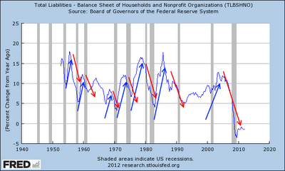
Commenting on the post from Pragmatic Capitalism, The Arthurian comes to a similar conclusion:During the boom you get lots of credit expansion, so total debt goes up a lot. During the bust you get little credit expansion, and total debt goes up only a little. But total debt goes up, either way. (Until the crisis, of course. And that's why there eventually is a crisis.)
There ya go: When credit expansion declines, you have recession. When total debt declines, you have depression. There's a definition for you.
Don't worry, it's not set in stone. It's not fate. It's just stupidity. We *insist* on using credit for growth. We *insist* on using credit for everything. We *insist* on using bank-issued “inside money” as our primary form of money. Change that, and we change the world forever.
Always keep in mind the ratio between inside money and outside money.
Some people want to go back to gold. Some people want 100% reserve. I just want to reduce the debt-per-dollar ratio to a workable level, and keep it there. The same system we knew and loved for 60 years, only not so extreme.Clearly in agreement with the conclusion, I decided to explore the italicized statement above. Earlier in the post, The Arthurian said:
you can get a feel for the ratio between inside money and outside money, by looking at a picture of debt per dollar of circulating money. Or at debt per dollar of base money.Since the graphs at those links were a bit out of date, here are the updated versions:
Debt-per-Dollar of Circulating Money

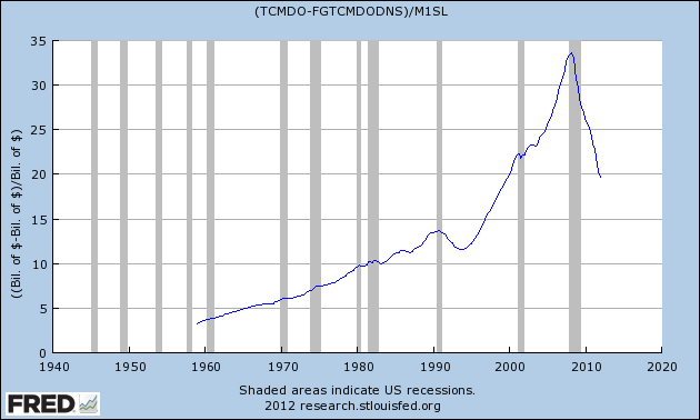
Debt-per-Dollar of Base Money

Both charts depict the persistent rise in debt-per-dollar from the 1950’s until the late 2000’s. Although the decline is pronounced in the past few years using either metric, the degree to which the ratio has retraced its 60 year rise is markedly different. Choosing the appropriate measure is therefore necessary if we are going to implement The Arthurian’s plan “to reduce the debt-per-dollar ratio to a workable level.”
Since both graphs use the same measure of total debt, the stark difference in rate of decline is clearly due to changes in circulating money (M1) versus base money (MB), shown in the following chart:

Digging a bit deeper, the sharp rise in base money over the past few years is largely attributable to an increase in excess reserves:
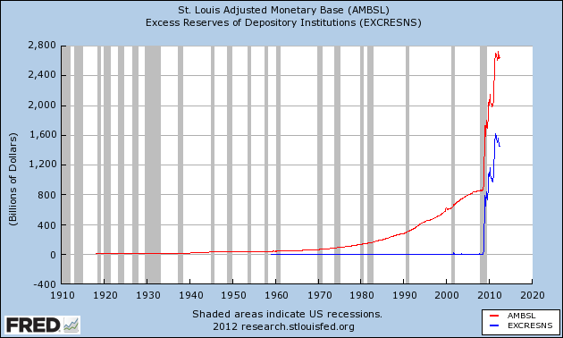 This chart, which is incredibly important for our discussion, suggests that the rise in excess reserves is the primary driver between the diverging rates of decline in the two measures of debt-per-dollar. Why is this important? The increase in excess reserves, engineered by the Federal Reserve, is primarily just an asset swap with private financial institutions. Since the Federal Reserve is purchasing US Treasuries and agency-MBS (liabilities of the US government), the economic sector which is really witnessing a decline in its debt-per-dollar is the US government.
 Deconstructing the argument one more time, this graph again shows total credit market debt owed, now also separated out by the federal government and the private sector (blue line):

For nearly 60 years, private debt growth (credit expansion) continued unabated both in nominal terms and relative to federal debt. Although this provided a tailwind for economic growth, the legacy of accumulated debt is burdensome interest costs. While spending by the federal government is unconstrained by income, due to monetary sovereignty, the private sector is not so fortunate. When accrued interest costs (debt) become large enough, an economic shock (either exogenous or endogenous) may cause the private sector to increase savings and/or debt repayment and thereby decrease consumption and investment. If these actions are pursued in the aggregate, a “paradox of thrift” debt-deflation can take hold. In the US, this has been partially offset by the rapid rise in federal debt, but not fully given the exorbitant relative size of private sector debt.
Since private sector debt expansion and contraction has been a primary driver of the economy for at least 60 years, the debt-per-dollar ratio that best depicts the private sector should be the desired metric for policy reduction and stabilization. As shown above, the decline in debt-per-dollar of base money largely reflects an increase in excess reserves that does little to reduce the private sector debt burden. This last chart, however, displays private sector debt-per-dollar of circulating money:
Having decreased sharply since the onset of the Great Recession, this ratio remains at heightened levels only last witnessed at the beginning of the new millennium. We may still have a long way to go but reducing this debt-per-dollar ratio to a reasonable level will be worth it.
"Since the Federal Reserve is purchasing US Treasuries and agency-MBS (liabilities of the US government), the economic sector which is really witnessing a decline in its debt-per-dollar is the US government. "
ReplyDeleteOh, that is interesting! I have to think about it some.
"While spending by the federal government is unconstrained by income, due to monetary sovereignty, the private sector is not so fortunate."
Exactly! (Why didn't I think of that???)
I definitely prefer to look at money in circulation (M1) so I like your ending!
It is not shown because FRED starts so late, but the whole "golden age" shows the same increasing trend. I hold the view that somewhere around 1966 or 1974 accumulated debt started interfering with the good times -- first by raising costs (giving us cost-push inflation), then by hindering growth (giving us stagflation)...
Around 1990 the numbers fall for a few years, and when the growth resumes we had another "golden" period, or what Robert Gordon called a "macroeconomic miracle"
The level and the trend of this ratio is intimately related to economic performance.
The older data show a major peak associated with the Great Depression and a decline during the FDR years.
Appreciate the comments and insight on the older data. I'll have to figure out a way to graph equivalent data going back to the Great Depression.
DeleteAn interesting thought I had on the early 1990's decline, is that it coincided with the last time national home prices fell year-over-year. The Case-Shiller data shows a peak at the end of 1989 that isn't surpassed until around '93. Since mortgage debt accounts for such a large percentage of household (and private) debt, it makes sense that declines in prices could hinder credit expansion. As households became even more levered (less money down), this process would likely have been exaggerated, as witnessed.
Given that assumption, an important aspect of policy to reduce the debt-per-dollar is ratio is clearly limiting the LTV of mortgages. Keen has a good proposal for doing this based on income of the property (http://www.debtdeflation.com/blogs/wp-content/uploads/2012/01/TheDebtwatchManifesto.pdf, page 30).
The way you have this post laid out, with all those FRED graphs, I thought I was at Art's place for a moment. If your assumptions are correct, (I think they are), political actors in Washington will most likely compound the problem going forward. The preoccupation and near obsession with public debt reduction, with no concern or focus on private debt relief only spells further slow growth and high unemployment. As the late Casey Stengl was fond of saying: "can't anybody here play this game?"
ReplyDelete